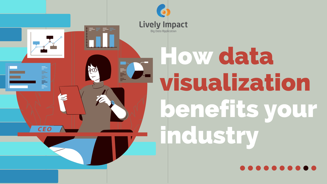
You may not necessarily be familiar with the term "Data Visualization", but you must have used it somehow. Data visualization is around us- your customer records in tables, the charts on your financial reports etc. Although the concept is nothing new, it has been buzzing around every commercial sector in recent years. What makes data visualization an essential technique for modern businesses?
What is data visualization?
Data visualization is often used interchangeably with other terms like information graphics, information visualization and statistics graphics. However, they all referred to the same concept- to translate information and data in graphical representation by visual contexts. Some typical types of visualization include charts, tables, graphs and maps. Besides, there is more specific visualization such as cartogram, timeline, tree map and many more. Converting the numerical data into graphics makes it easier for people to understand and identify patterns, trends, and outliers in large datasets.
What can you get from data visualization?
Some define data visualization as a technique in the middle between data analysis and visual storytelling. Good data visualization can make your work much easier by being a powerful tool for storytelling. It removes the noises from data and highlights only the valuable information from the datasets. Also, with data in visual representation, it is more understandable to you and your clients. Because, after all, compared to numbers, we are more easily attracted to colors and patterns. Visual elements can place a more remarkable impact on us than numbers. Therefore, data visualization can also be described as a form of visual art to retain customers' attention on the data's message.
The message derived from datasets by visualization is more digestible to professionals and more valuable for decision making. You can obtain the information you need from direct observation on the visual. While the content can be understandable by everyone, it facilitates communication between stakeholders. Data visualization is a tool to convey the who, what, when, where and how of datasets. It is an effective medium to encapsulate the information inside a dataset.
Data visualization is more important than ever
We have long been using data visualization in every industry. Nowadays, this technique is more critical than ever because of the rise of Big Data projects and advanced analytics. Companies are collecting millions, even trillions of data records, every day. Their ultimate purpose is to extract useful information from the datasets. However, humans are incapable of processing numerical data in such an enormous amount. The processing time is unimaginable. Data visualization is, therefore, the key tool to let people see and make sense of trends, outliers and patterns in the data rapidly and easily.
Data visualization can effectively speed up and present the information to business owners and stakeholders in big data projects. Big data visualization are often beyond the typical techniques and uses complex representations, such as heat maps and fever charts. The accuracy of big data visualization depends on the accuracy of the data used. So, a precise quality control of corporate data is essential. Data visualization is not just placing information in a visually appealing manner. Effective data visualization is about balancing form and function. Data visualization is pursuing the balance between between data and visuals. Failure to achieve on either side would not result in satisfaction. The stunning visual may be eye-catching but fails to convey a useful message. On the other hand, a simple graph may be excellent in delivering the message but fails to keep the audience's attention. To obtain the best output and benefit from data visualization, the data and visuals must work together.
Data visualization use cases in different sectors
Marketing
With increasing global investment in online marketing, marketers have gradually paid attention to setting up their online strategies. With data being available everywhere on the internet, marketers can quickly obtain the data needed to evaluate their performance online. Using data visualization, marketers can effortlessly interpret patterns and trends analysis, for example, sales analysis, customer analysis and forecasting using visual and reports. Moreover, well-organized visual information speeds up the understanding of data and decision-making, which enhances productivity. Logistics The top use case of data visualization in the logistics industry is optimizing the best shipping route. It aims to shorten delivery time while maintaining the quality of the required task. The use of this tool saves time, fuel and money. Another use case is the choropleth map. The choropleth map is a solution to present how a measurement is different across a geographical area, for example, the sold per country. The darkness of the colors indicates the level of performance in that region. Visualization offers a direct comparison between the performance of various areas, which promote efficiency. Retail The retail industry is the most enthusiastic about data visualization tools. By equipping themselves with the best data visualization technique, they successfully address and overcome the industry challenges. For instance, the US retail company, The Home Depot, has used data visualization to monitor stocking levels and availably and successfully address the stock replenishment challenge. Moreover, the stock availability is also visible on their mobile devices. The visualization of stock information saves time for employees to search for an item when needed. Furthermore, for large retail companies that have businesses around the world, data visualization helps them efficiently manage and evaluate the performance of their businesses across regions. For example, companies can visualize their sales performance with a heat map, so the decision-makers can easily compare and review the sales in a different area, facilitating decision-making. Healthcare Due to COVID 19, data visualization has unreplaceable importance in the healthcare sector. During the pandemic, people collect numerous data to manage the crisis. After analyzing the collected data, people utilize the technique of data visualization to represent the data in a neat form, which the medical personnel and the public can easily understand. For instance, people analyze demographics and urban activities to monitor the usage of healthcare facilities, determine risk areas and map virus spread. The applications have successfully saved lives and prevented health risks from getting worse, which significantly impacted the healthcare sector. Besides the crisis, the healthcare sector has thoroughly examined and analyzed public health from demographic and geographic information. People benefit from this tool to improve their productivity, efficiency and quality of decision making.
References:
The Importance of Data Visualization in Marketing - smartboost What Is Data Visualization? Definition & Examples | Tableau What is data visualization and why is it important? (techtarget.com) How data visualisation can help the logistics industry become more efficient | Logistics Manager 5 Sectors That Benefited Most from Data Visualization Software | Aspectum Data Visualization Use Cases: How is Data Visualization Used? (datamation.com) 
Subscribe to us now so you won't miss the latest MarTech information and trends!
By submitting this, we will only use data provided to us in accordance with our Privacy Policy. Comments are closed.
|