PowerInsight™
Data Visualization Solution
What is PowerInsight™?
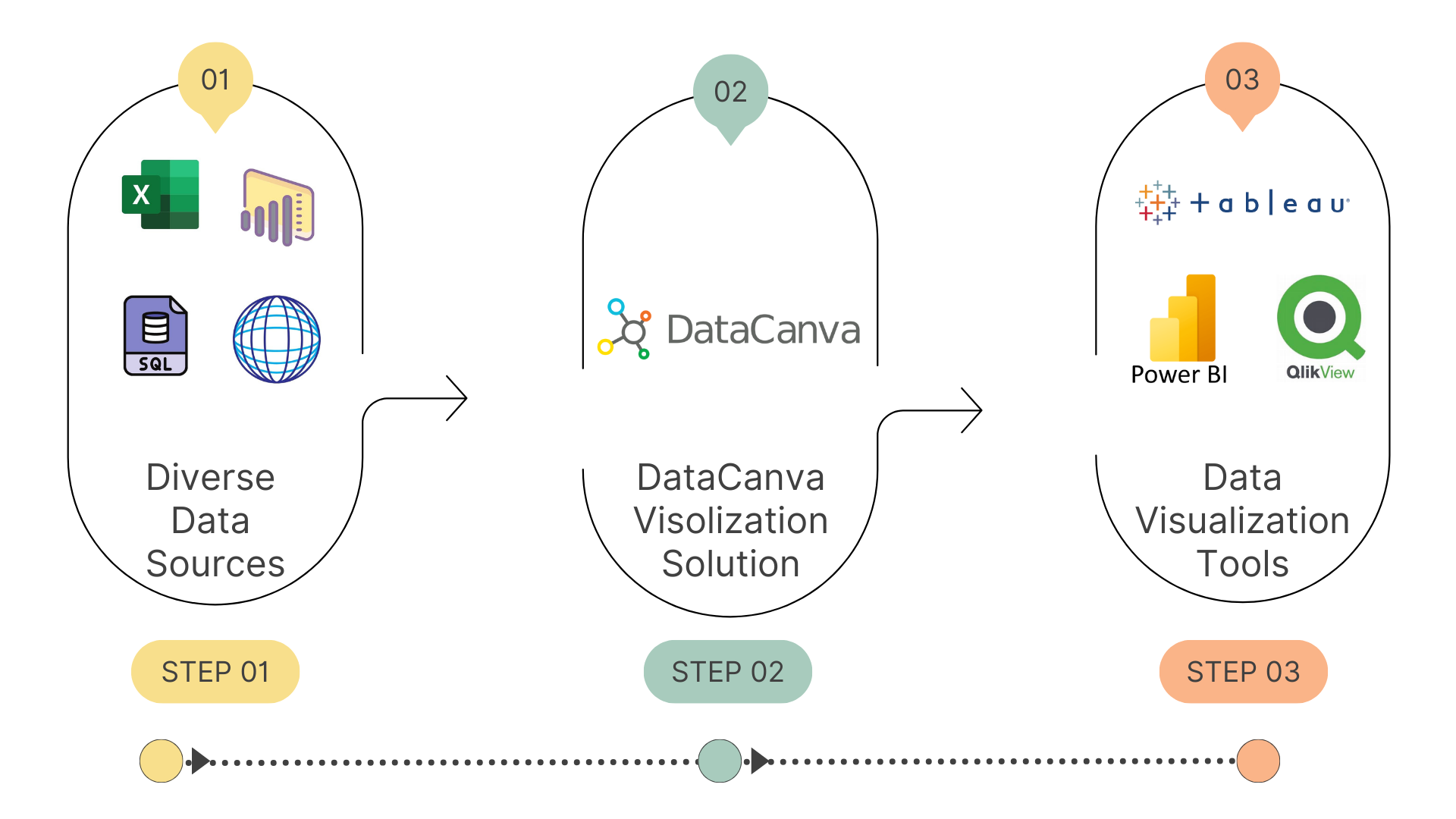
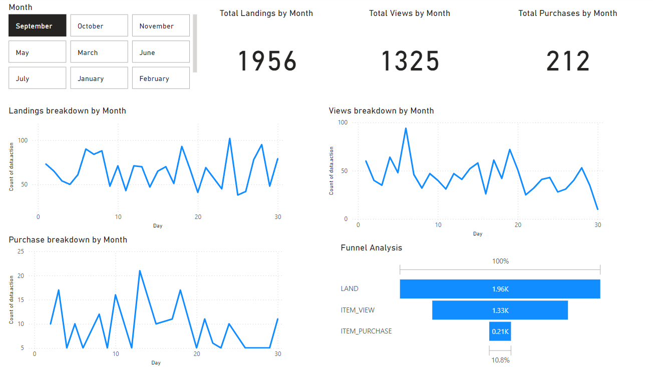
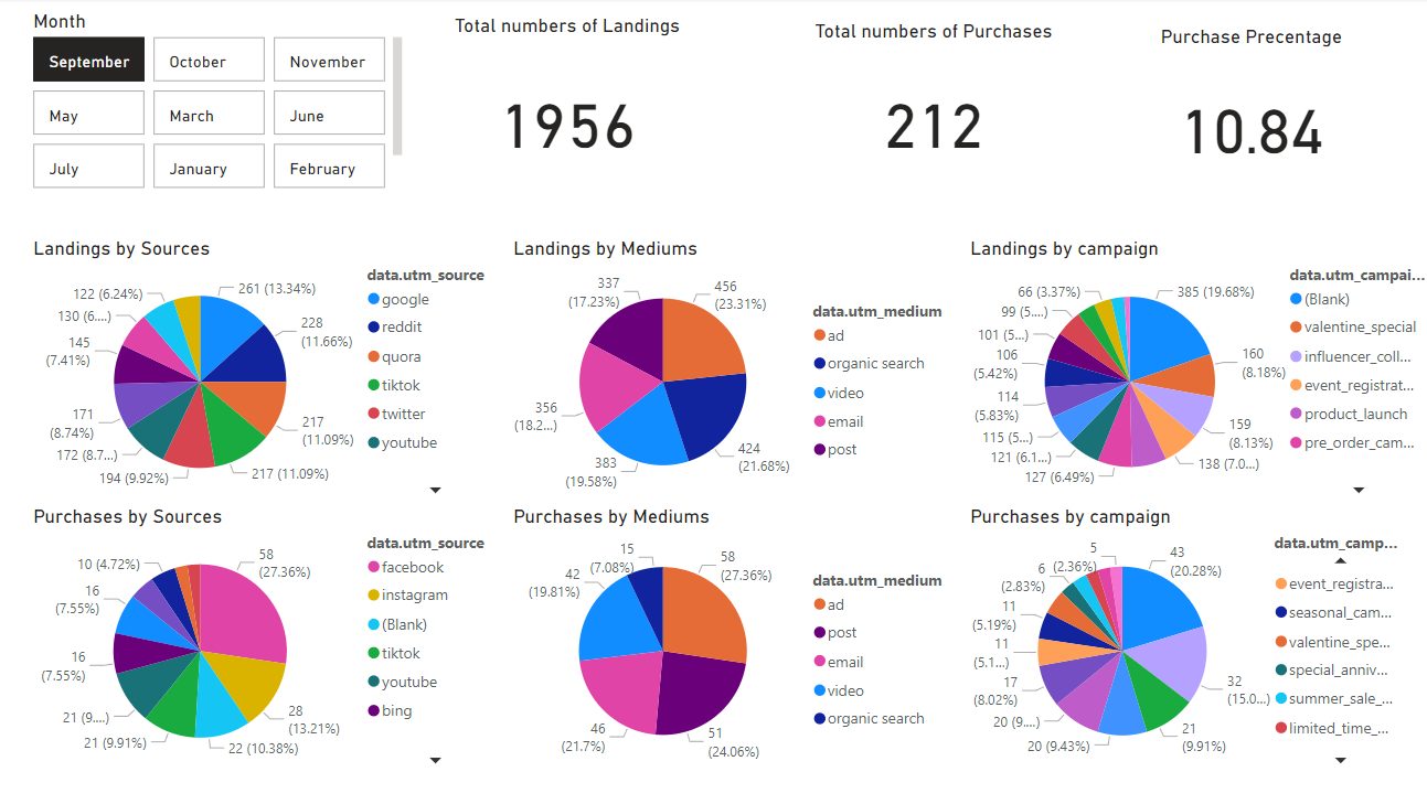
How does this work?


Key Steps of Data Processing
Key Features of PowerInsight™

Clarity and Accessibility
Simplifies complex data, making it understandable for a broader audience, including non-technical stakeholders.

Pattern Recognition
Facilitates the identification of trends, correlations, and anomalies that might not be apparent in raw data formats.

Storytelling
Enhances data presentation by weaving narratives, which helps to convey insights effectively.

Interactivity
Many visualization tools offer interactive elements, allowing users to engage with the data and explore different facets dynamically.

Diverse Formats
Supports various visualization types, including charts, graphs, maps, and dashboards, tailored to the specific data and audience needs.
The Value of PowerInsight™
1
Informed Decision-Making
By presenting data visually, organizations can make faster and more informed decisions based on insights derived from the data.
2
Enhanced Communication
Visualizations can break down complex information into clear visuals, improving communication across teams and stakeholders.
3
Increased Presentation Engagement
Interactive and visually appealing data presentations can capture attention and engage audiences more effectively than static reports.
4
Efficiency in Data Analysis
Enables quicker analysis of large datasets, allowing users to derive insights and make data-driven decisions rapidly.
5
Support for Increasing Data Volumes
As organizations increasingly deal with large volumes of data, visualization becomes essential in making sense of this information and extracting valuable insights.


